FuriousPaul.com Site Layout Suggestions
I have been getting a lot of great feedback on my Overwatch guide's content which I greatly appreciate. All the positive feedback on my guide motivates me to continue to improve it and make it the best Overwatch guide on the web. But I have been getting a lot of negative feedback about my site layout. A lot of people are saying it is bad on the eyes. Some say the layout looks old. Some say the color scheme is bad, etc..
Black background
When I first made FuriousPaul.com back in 2013, my original intention was to
make it look a bit different than other websites. I wanted it to have a
more unique look to it. I chose a black background because I think it
looks cool and also preserves energy for OLED devices. OLED screens do not
consume energy for black pixels. This means that black backgrounds save a lot
more energy than white backgrounds when used with OLED devices. This can
save on battery life for handheld devices or future OLED monitors. A black background makes a site more future proof as far as energy
consumption goes.
Color Scheme
I personally like the color scheme I chose for my site. I am using a
reddish color to represent a site title, an orange color to represent a content
title, and green to represent a hyper link. That's it, only 3 main colors
(besides white for text).
I chose orange for content titles because I like Halloween type stuff and It kind of reminded my of that in a way. I even launched my site on Halloween anyways.
Navigation
My site uses a unique navigation system because I wrote the entire
template code for the site myself. I did not use a 3rd party platform like WordPress, instead I wrote everything myself. That's how I wanted to do
it. I am also using the latest HTML 5 standards with CSS3 for styling, so
everything is up to date with that. I also did this because I wanted to
learn HTML5 coding better. Things might not look as modern because of
this, but I was totally fine with that.
I wanted my site to have a simple clean appearance that was very basic. I wanted to show all the links clearly on the screen (no drop down menus). I know the template looks a bit old, but that was part of my original intention with the site.
What is your suggestions?
In my eyes everything looks good and I am not sure how I can improve it. Maybe people just need to get used to it after awhile?
I want to hear from others why my site looks so bad on the eyes? I am open to suggestions to improve the layout so people can easily read it without hurting their eyes. I am open to all suggestions, feedback, opinions and ideas for improving my site design.
Is the color scheme too "busy" for people's eyes? Is the green hyper links to bright? Should I make them dimmer? Should I remove all reddish site titles and just make them white? Do I need to increase the size of the fonts?
UPDATE May 15th:
I have dubbed down all the bright colors on my site and made them dimmer,
including the green hyper links, white text, and everything else except the
orange and red text. I also increased the font size and font line spacing.
Hopefully this is better and won't strain people's eyes. If you want to
compare to how it used to be,
try this link out.
If this improved anything for you, please let me know, otherwise I will revert it.
Please write your suggestions and feedback down below in the FB comments!
News/Home | Blog | Follow | Unlock Full Guide
Attack |
Defense |
Tank |
Support |
 Genji
Genji Bastion
 D.va
D.va Ana
Ana McCree
 Hanzo
Hanzo Reinhardt
 Lucio
Lucio Pharah
 Junkrat
 Roadhog
 Mercy
Mercy Reaper
 Mei
Mei Winston
 Symmetra
 Soldier76
 Torbjorn
 Zarya
Zarya Zenyatta
 Sombra
 Widowmaker
 Tracer
Map Guides
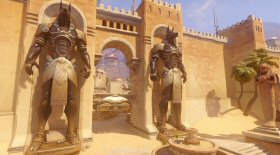 Temple of Anubis
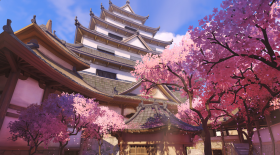 Hanamura
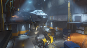 Watchpoint Gibraltar
Overwatch Hero Introductions - Basics Guide
How the Mechanics Work in Overwatch
How Headshots Work In Overwatch
Overwatch Game Modes Overview
Overwatch Health Types & Hitpoint Basics
Overwatch Terms, Abbreviations, & Their Meanings
Easiest and Hardest Overwatch Heroes to Master
My Hotkey
Bindings For Overwatch & Why I Use Them